5 MINUTE READ
Written by Jabiha Razi
Your website is the most significant digital space to convert first-time visitors into brand advocates. The design of your website is the primary tool to make this conversion possible because it reflects your business image. Therefore, your website design has to establish a professional and credible authority that strikes a trusting relationship between you and your customer. This article highlights some practical tips for creating professional and high-impact website designs.
Research says humans form first impressions as fast as within one-tenth of a second. Furthermore, the first impression filter remains with us even when we interact with the same person at a later stage. All the information we process about a person in these following interactions goes through that first impression filter. Therefore, you must create a stunning first impression from your website design.
However, how you design your website is somewhat related to your industry norms, business requirements and target market. Yet, a few guidelines make your site unforgettable and highly engaging.
- Elements with standard placement
- Brand consistency
- Rule of thirds
- Minimal design
- Stunning photography
- Simulate real-life experience with the product
- Negative spaces
- Create contrast
- Text
- Home and landing pages
- Design for mobile first
Elements with standard placements:
Creativity is half novelty and half familiarity. In some cases, it is better to follow the familiar route. Customers are accustomed to seeing a few elements on specific places on your website and can get confused with changes to these locations. Some of these elements are:
- Logo
- Navigation bar
- Shopping Cart/Bag
- Contact
- About
Logo: Most businesses keep the logo on the top left of the website design. Rightly so. Generally, the audience first scans the top left part of a website due to the English language’s left-to-right-written flow. For websites in languages with a right-to-left written flow, the opposite is true.
A website not displaying the brand logo as the first piece of communication weakens the brand’s authority. Besides the top-left position, the centre top is a preferred location for logo placement.
Navigation Bar: Keep the bar horizontal, preferably at the top of the page. The navigation bar in your website design should quickly take a customer to the desired page. Therefore, keep the navigation bar short and display a few priority links. Hide any lower-value pages under the main navigation bar.
According to famous American-British psychologist William Edmund Hick, the more choices you give a person, the higher the time they need to decide. This law applies to your website as well. The more options you provide to your audience in a navigation bar, the more indecisive they become in choosing a path to move on.
Cart/Shopping Bag:
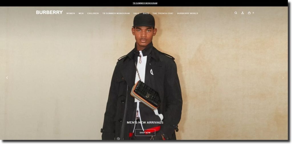
Keep the cart at the top if you use your website for selling. Remember, this is the most important item we want our customers to visit and should be prominent. If possible, it should be in a bold contrasting colour in your website design at the top right. See the Burberry logo, navigation bar, and shopping cart placements.
Contact: If your homepage requires the audience to contact you as the next step in the customer journey, keeping the contact button in your website design at the top or a prominent location above the fold is most convenient. Such top placement is beneficial for B2B and service-oriented companies. Placing the contact button in the right place helps reduce search time and negative experience of the audience.
About: There are always new customers landing on your website. You must have an “About” or “Company” page to create trust. Utilize this page to establish trust and authority; explain your business and what makes you a preferred choice. “About” is generally a part of the navigation bar in your website design.
Brand consistency:
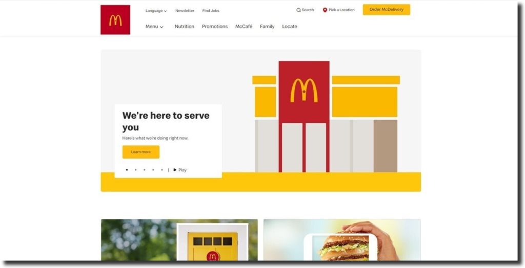
Use the brand colours in your website design to strengthen the recall of your brand. However, over-emphasizing brand colours should not reduce your virtual presence’s clean and crisp feel. Very dark brand colours often pose this problem. Look at McDonald’s image to see how they have incorporated brand colours into their virtual real estate.
Rule of thirds:
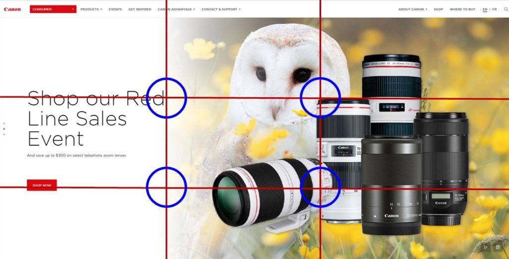
Follow the rule of thirds while composing your website design. This rule helps create a logical eye movement path. You divide the canvas into three equal rows and columns. The essential design elements are placed on the intersections of the lines. In this way, the audience does not ignore vital information. Take an example of this Canon promo banner.
Minimal design:
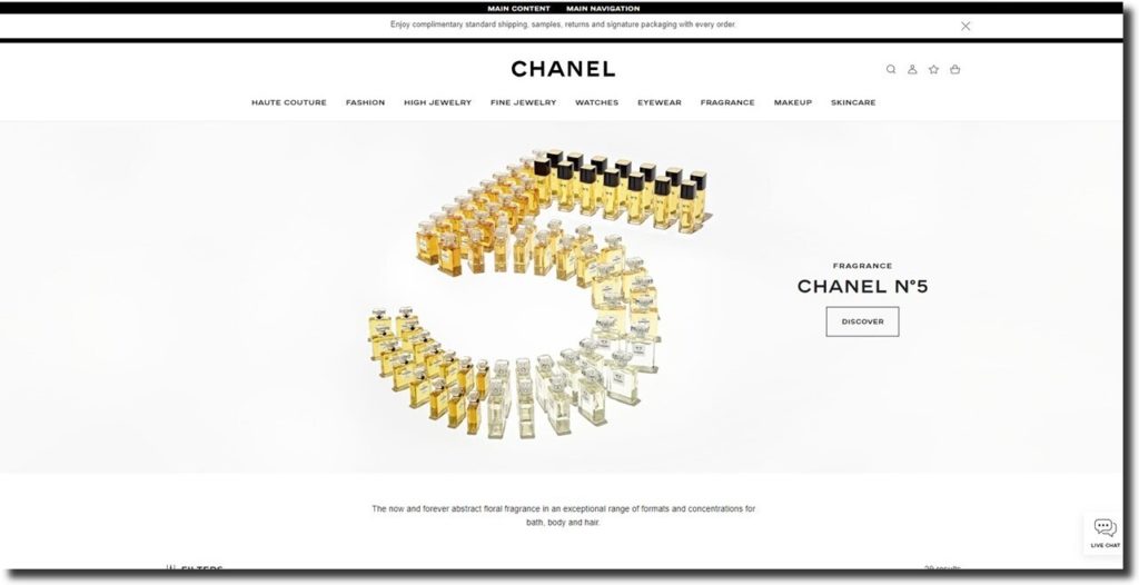
When adding prop elements to your website design, it is judicious to err on the lighter side. This brilliant tactic strengthens the brand footprint in the audience’s minds. See this design of Chanel No. 5 as an example.
Stunning photography:
Leverage creative photography on your website to strengthen brand imagery and associations. For instance, to increase focus on the subject, isolate it or make it “in-your-face”. Photography by Afia from Photos by Afia
To enhance interest, create depth in the foreground to give perspective, show a frame within a frame, and so on. There are many techniques professional photographers like Advansis Virtual can employ to create novelty for your brand.
Simulate real-life experience with the product:
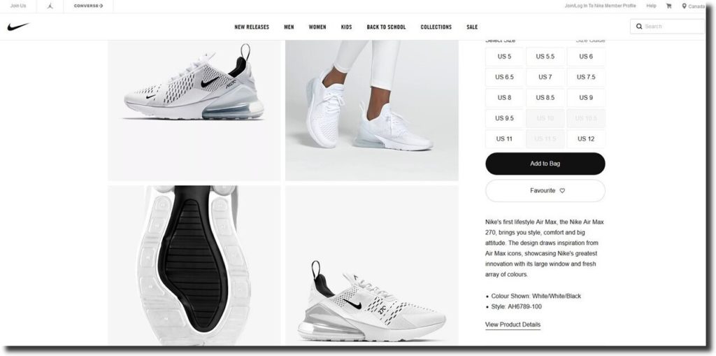
How you create the product experience through your website design plays a significant role in making a purchase. If you have an e-commerce website, ensure the product experience is as close to reality as possible. For instance, allow customers to see the products up close from all angles using Zoom, 360-degree views or virtual reality. Show the product in use. Take a look at this product page of Nike to get an idea.
Negative spaces:
Negative space in your website design relieves the eye and enhances focus on important information. Negative space means more of a blank area around the elements. You should create negative space between graphics and text, at the boundaries of a webpage, or between two lines of text.
Furthermore, the smaller the text font size, the larger the negative space required between two lines to make them readable.
Create contrast:
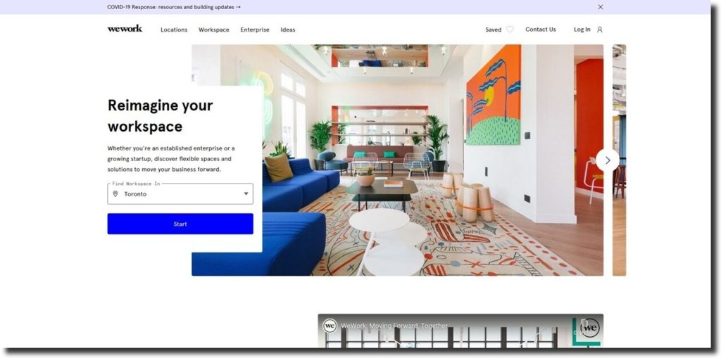
The text should be in contrast to the background. The most appealing difference in your website design is a white background to a black text. White gives a crisp look to the page. However, it would help if you remembered how well this goes with your brand colour pallet. You do not want to shift completely away from the brand colours. WeWork meets the criterion of negative space and contrasts nicely.
Text:
Keep the paragraphs and sentences short. A section should tell one main point about your topic and should not be more than three to four lines. Instead of making lengthy descriptions, use bullets to make your website design more readable.
Home and landing pages:
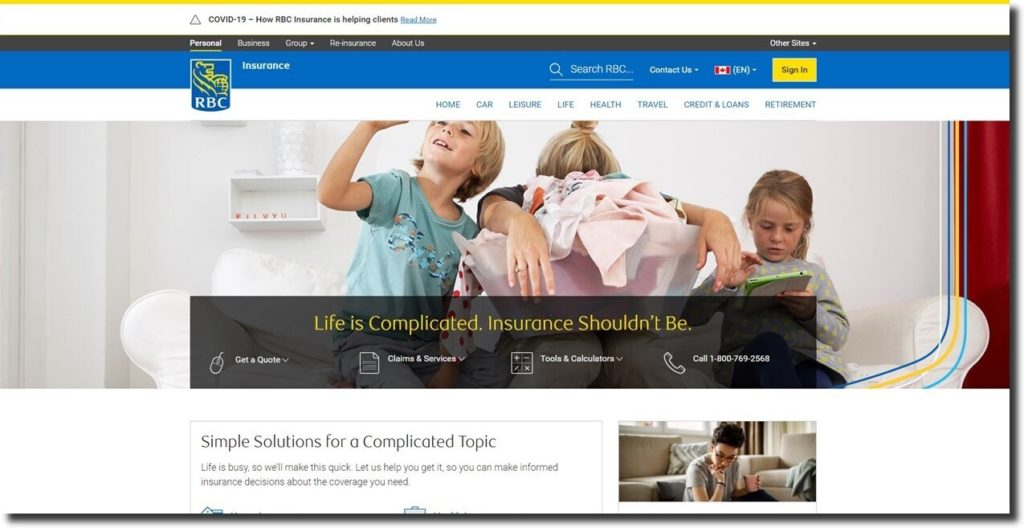
Although home and landing pages often serve different purposes, say more with pictures than words on both pages to capture attention and make a compelling call to action. Take a look at RBC’s design.
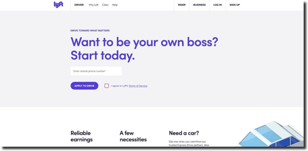
Here is a high-impact call to action on the Lyft website. Notice how the website design incorporates the high-contrast call to action button to expedite conversion.
Design for mobile-first:
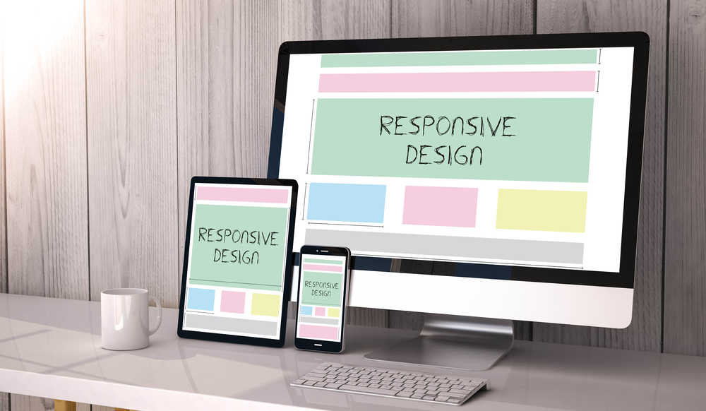
We browse more on our cell phones than desktops. Furthermore, many website speed performance tools like Google Page Speed Insights emphasize a smooth smartphone browsing experience. Therefore, it is practical to design your website with mobile usage in mind and then move backwards to make larger versions of layouts for tablets and desktops. Ensure optimized images for the small screens; forms trigger the proper keyboards; clickable buttons work properly on smaller screens and do not overlap other elements.
Conclusion:
In a nutshell, your overall website design should entice and delight your audience. It should effectively direct your leads through the marketing funnel. Like your physical store, it should attract and convert customers into repeat customers and ultimately advocates of your brand at the most optimum acquisition cost.

