Colour psychology is a well-documented and strategically used principle in marketing. It influences how consumers perceive brands, products, and services. Marketers leverage specific colours to evoke emotional responses, shape brand identity, and ultimately drive purchasing decisions—often on a subconscious level. Understanding how colours affect mood and behaviour allows businesses to create visual cues that align with their message, market position, and customer expectations.
At its core, colour psychology studies how different hues impact human emotions and cognitive functions. This translates into practical applications in marketing, from logo design and product packaging to websites and advertising campaigns. While cultural associations and personal experiences play a role in how individuals interpret colours, specific general patterns are consistent across large demographics.
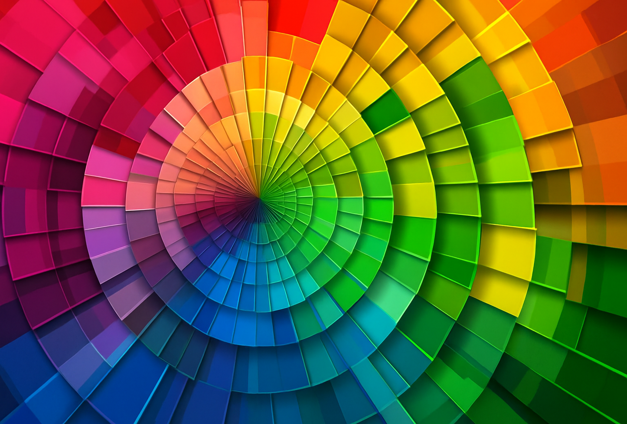
Red, for example, is associated with energy, urgency, and passion. It increases heart rate and creates a sense of excitement, which is why it is commonly used in clearance sales or fast-food branding. Think of Coca-Cola, whose red branding is associated with joy and liveliness.
Blue, on the other hand, evokes calmness, trust, and stability. It’s often used in industries where reliability is critical, like finance, healthcare, and technology. Brands like PayPal and IBM use blue to reinforce a sense of security and professionalism.
Yellow grabs attention and conveys cheerfulness. Used sparingly, it can make a brand seem optimistic and friendly, as seen in McDonald’s golden arches. Overuse can cause visual fatigue or anxiety, so balance is key.
Green is linked to nature, health, and sustainability. It’s popular among wellness, organic, and eco-conscious brands because it implies freshness and environmental responsibility. For example, Whole Foods uses green to strengthen its natural, healthy brand image.
Black symbolises sophistication, luxury, and authority. High-end fashion brands like Chanel and Prada use black to convey exclusivity and elegance.
White implies purity, simplicity, and cleanliness—qualities often highlighted in the tech and healthcare sectors. For example, Apple’s use of white space communicates minimalism and modernity.
The power of colour psychology in marketing lies in its ability to influence consumer emotions and choices—something successful brands have long understood and strategically applied.
These colour choices are not arbitrary. Research shows that up to 90% of snap judgments about products can be based on colour, depending on the product type. Moreover, colour can increase brand recognition by up to 80%. This explains why consistency in colour branding is essential—it builds familiarity and trust over time.
However, effective use of colour in marketing goes beyond simply choosing a single hue. It involves understanding the target audience’s preferences, cultural context, and the emotional tone that suits the brand’s purpose. For example, while white symbolises purity in Western cultures, it can represent mourning in some Eastern traditions. Misusing colour can alienate potential customers or confuse the brand message.
In conclusion, colour psychology is a powerful marketing tool that taps into consumer emotions and subconscious associations. Strategic use of colour helps companies position themselves effectively, shape brand identity, and influence buying decisions. By harnessing this visual language thoughtfully and intentionally, marketers can create stronger emotional connections and stand out in an oversaturated marketplace.